Graphic Design
President’s Football Tailgates: Visual Identity, Collateral, Promotional Items, Event Branding
Brand development / Creative direction / Typography / Photography / Art direction / Graphic design
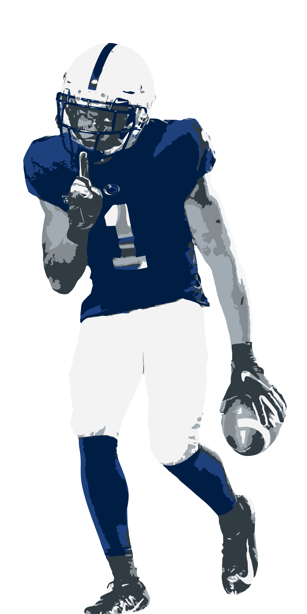
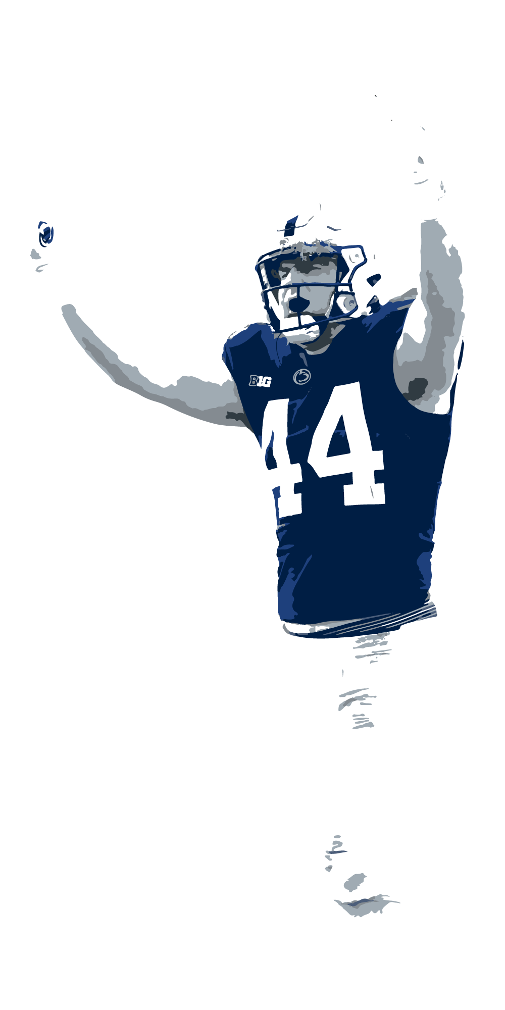
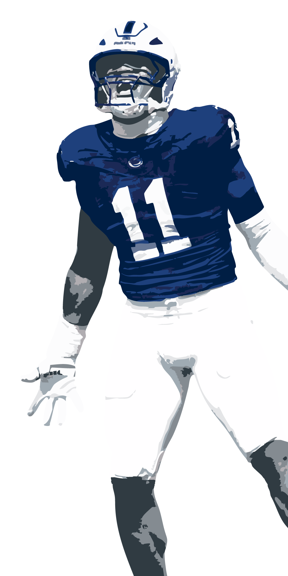
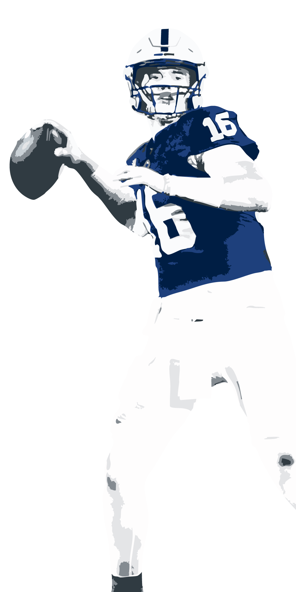
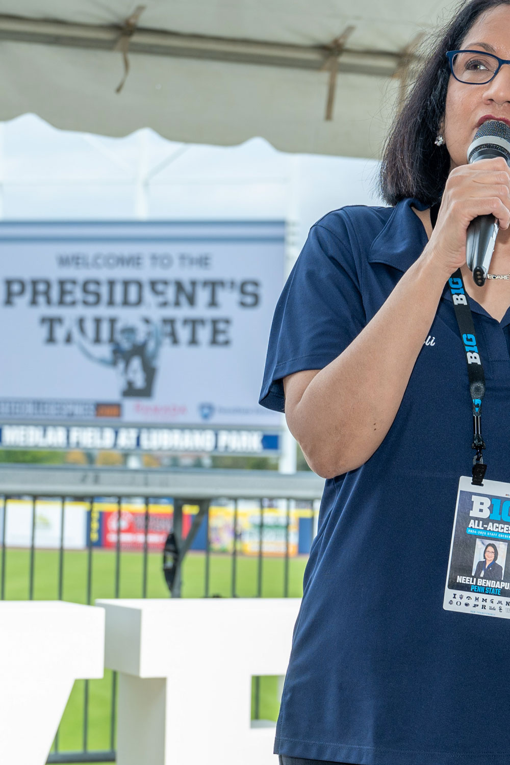
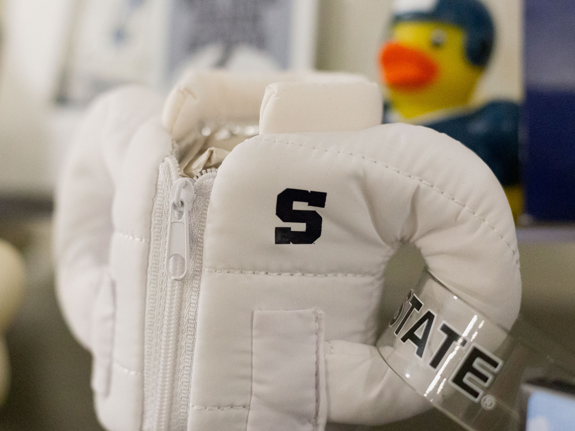
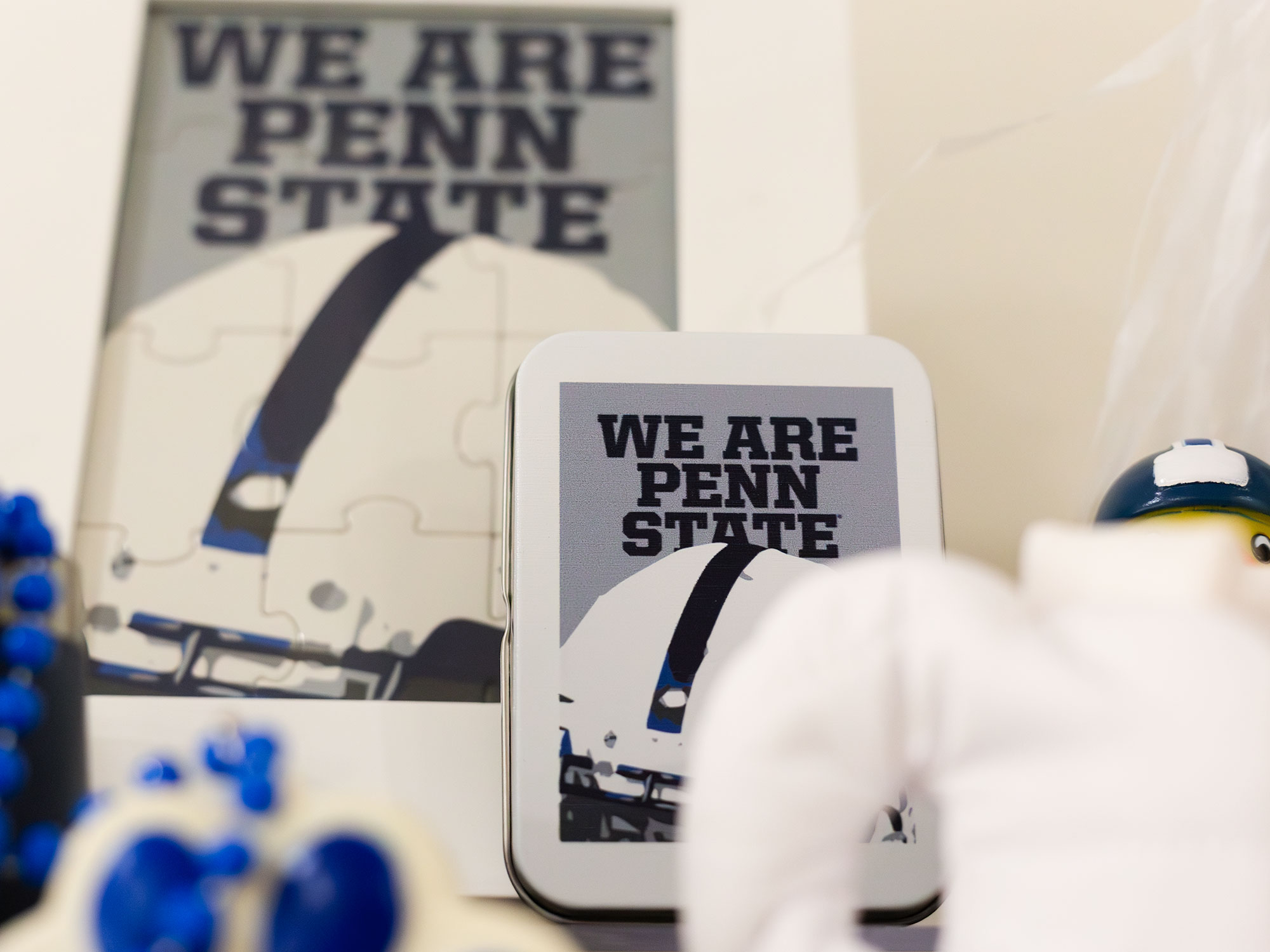
For President Neeli Bendapudi’s Presidential Tailgate series, I partnered closely with our Special Events team to shape the full donor experience—designing everything from the event’s visual language to environmental graphics and promotional items. The challenge was striking the right tone: capturing the energy of football season while maintaining an upscale, presidential feel that clearly set the event apart from a typical athletics gathering.
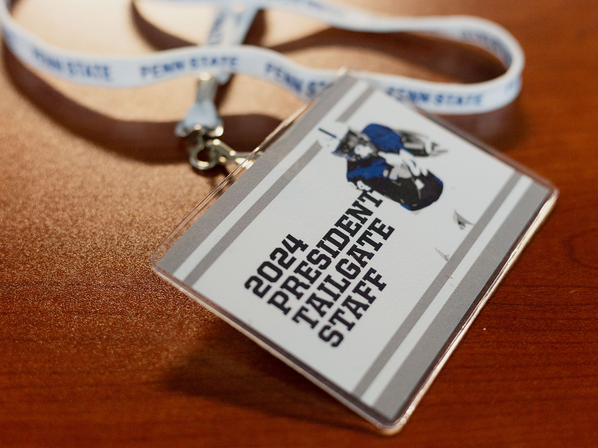
From invitations to on-site signage and curated giveaways, every touchpoint was intentionally designed to feel elevated, cohesive, and unmistakably Penn State—with just the right amount of flair.
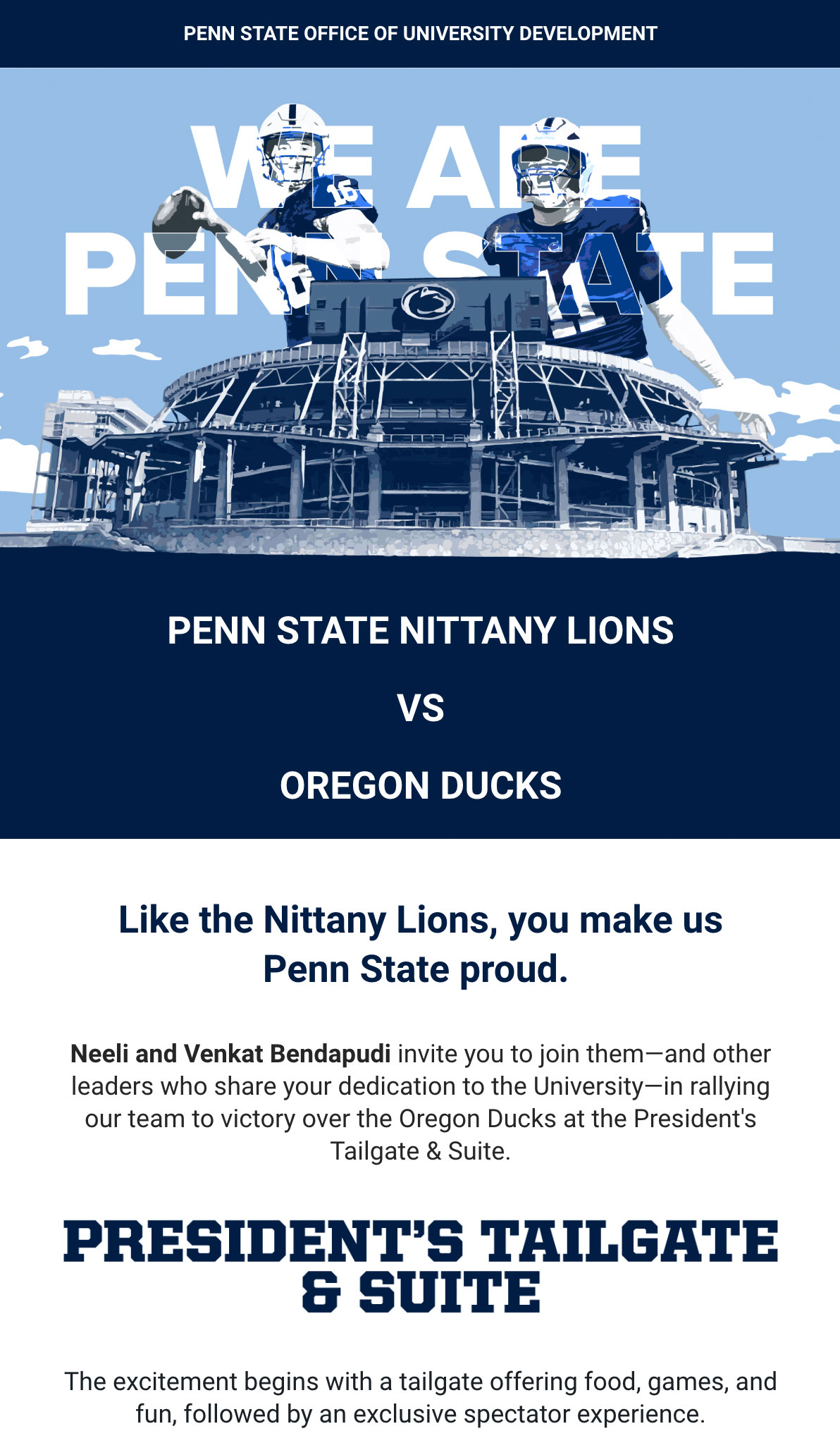
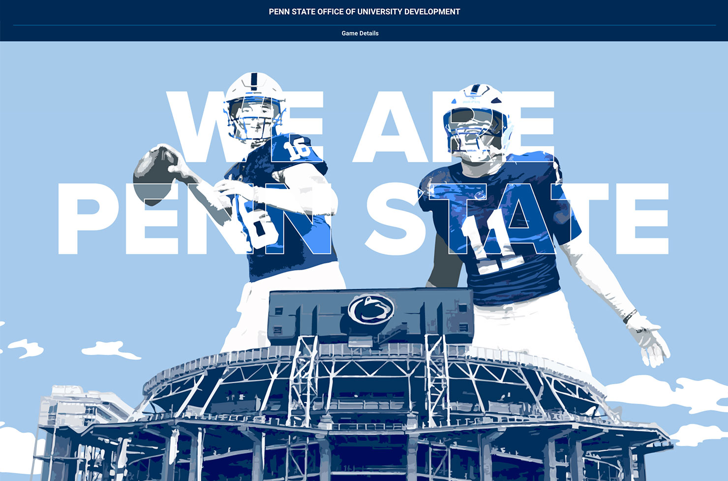
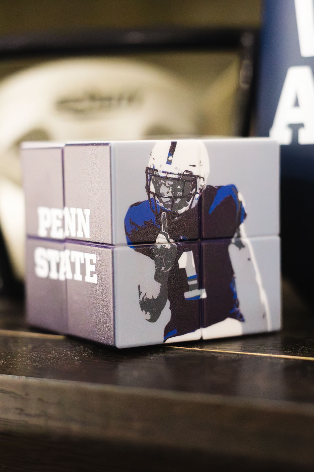
Stylized Player Graphics
Email Invitation & Website
The first touchpoint for the Presidential Tailgate experience was the emailed invitation and registration site—where I set the visual tone right out of the gate. I carried the bold, stylized player graphics into both to establish a clear, cohesive vibe from the very first click. From that moment on, every element a donor interacted with—from signage to swag—followed that same energetic and elevated look.
Promotional Items & Environmental Graphics
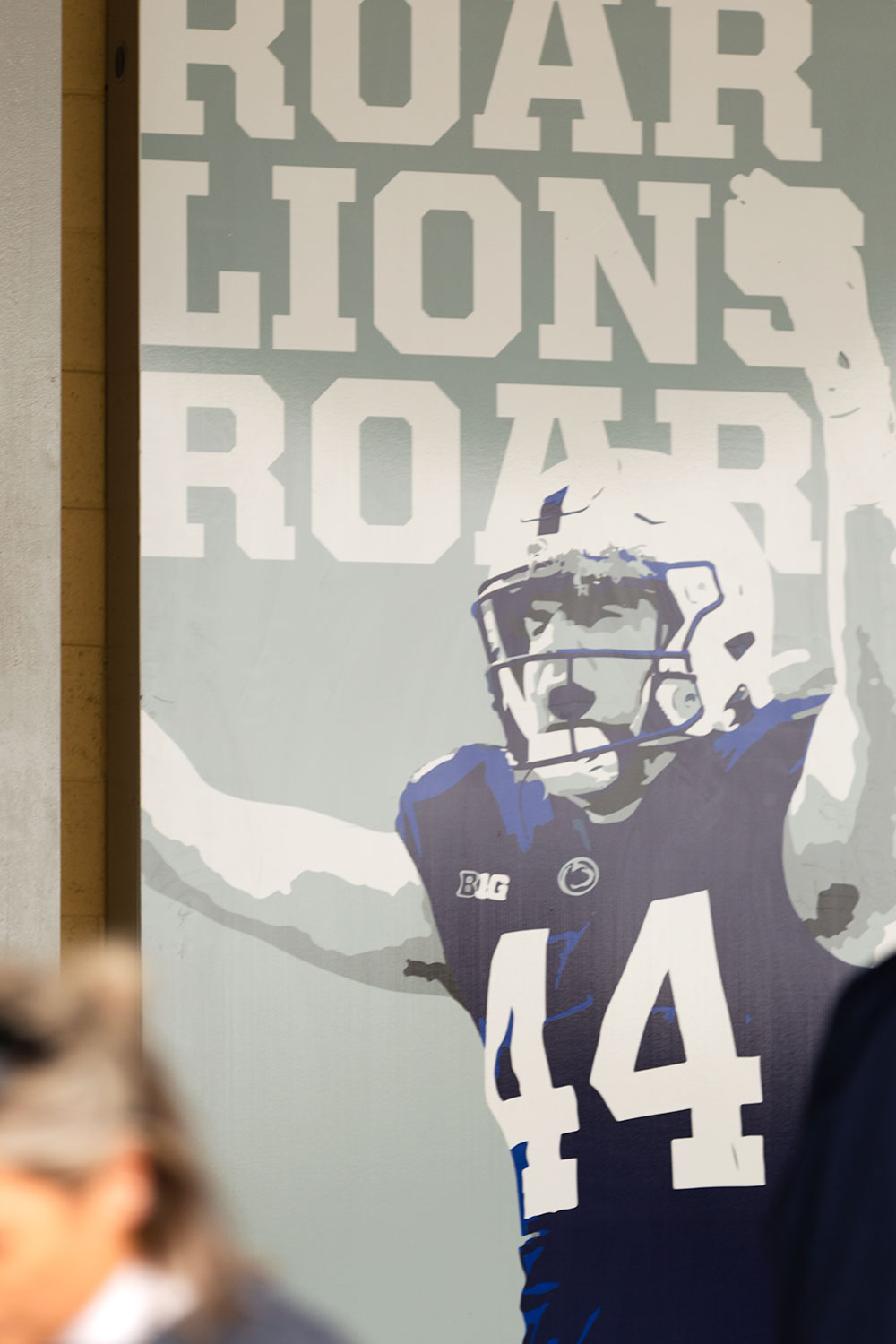
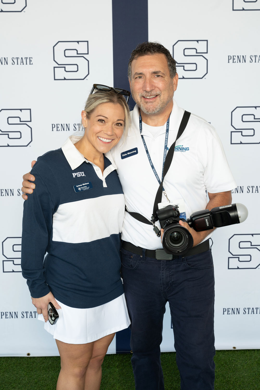
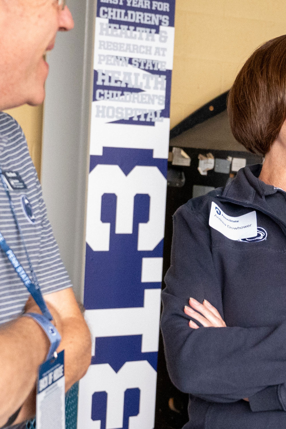
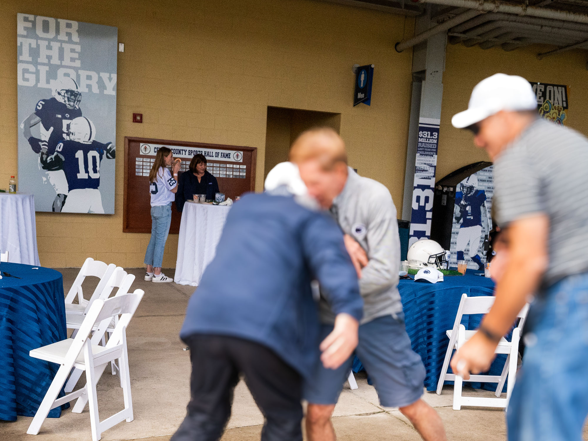
To bring the Presidential Tailgate to life, I extended the event’s visual language into every corner of the space—making sure the environment felt as considered as the invitation. The concourse of the adjacent baseball stadium was transformed with bold vinyl graphics, custom-wrapped arcade games, and giveaways that stayed perfectly on theme without slipping into throwaway territory. A branded photo backdrop gave attendees a fun spot to snap pics and share the moment—blending school spirit with subtle brand visibility, while subtle philanthropic messaging was woven throughout the space—proof that even a tailgate can carry a mission (without shouting it).
hpeGroup Visual Identity and Collateral
Brand development / Creative direction / Page layout / Typography / Photography / Art direction / Graphic design
Project Overview:
I developed a complete brand identity for hpeGroup — a small engineering start-up focused on integrating thoughtful design into structural solutions. From logo and stationery to brochures, photography, and promotional items, every element was crafted to reflect the firm’s balance of professionalism and creativity—qualities not often emphasized in their industry.
The team wanted to stand apart from competitors by projecting a refined, intentional presence. I took that vision to heart, shaping everything from the tone of voice to the visual style to align with their core values. The result is a cohesive, flexible brand system that communicates expertise, innovation, and a genuine pride in the built environment.
hpeGroup Logo
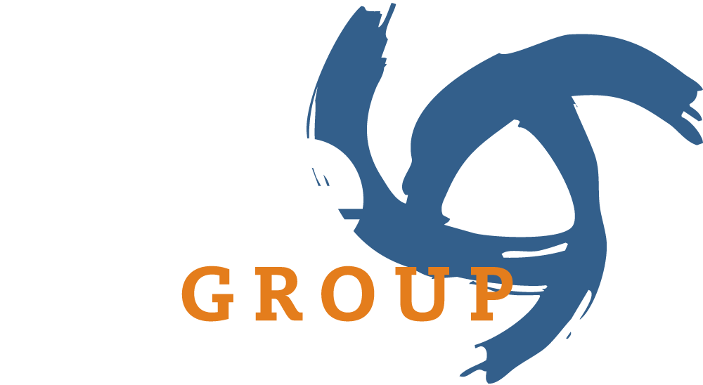
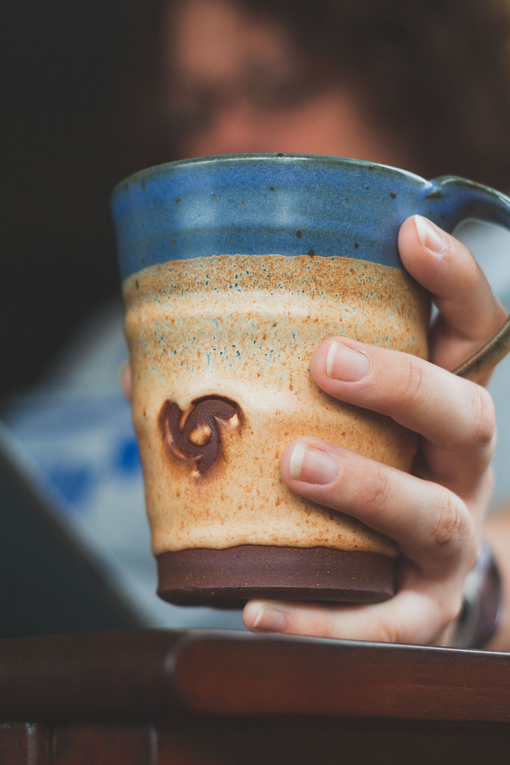
The logo set the tone for the entire visual identity. To reflect the partners’ strong design sensibility, I created a swirl icon using a painterly brushstroke—its three points representing the firm’s core services: HVAC, plumbing, and electrical. Paired with timeless typography, the result strikes a balance between corporate polish and creative personality that continues to serve the brand well.
hpeGroup Corporate Brochure
hpeGroup Promotional Items

(Okay—except for that one time we made an actual cookie cutter in the shape of the swirl logo. But even the cookies were on-brand.)
We Are Magazine Layout: Fighting Hunger
Creative concept / Illustration / Typography / Page layout
A thoughtfully designed layout that creatively unifies diverse content—quotes, stats, and stories—into a clear, engaging narrative on student food insecurity.
This layout was part of a feature on food insecurity for We Are, Penn State’s philanthropy magazine. The content came in small chunks—quotes, stats, and short stories—and the challenge was to bring it all together in a way that felt unified, clear, and human. I used bold visuals, simple icons, and clean type to guide the reader through the page and highlight the impact the Penn State community is making in the fight against student hunger.
We Are Magazine Layout: Bright Lights, Big Number
Creative concept / Typography / Page layout / Photography
A vibrant, celebratory spread combining bold design and compelling imagery to honor the close of Penn State’s major fundraising campaign.
This spread celebrates the close of Penn State’s major fundraising campaign, A Greater Penn State for 21st Century Excellence. I captured the photo during the campaign’s closing event—a moment full of energy, emotion, and student voices. The design challenge was to balance bold typography and vibrant quotes with a dynamic full-page image, creating a layout that felt as celebratory and inspiring as the event itself.
We Are Magazine Layout: Open Doors Need & Impact
Creative concept / Typography / Page layout / Photography / Information design
A clean, infographic-driven layout that simplifies complex data to clearly showcase the impact and importance of Penn State’s Open Doors programs.
This spread was created to break down the complex needs and outcomes of Penn State’s Open Doors programs. The original content was text-heavy, so my goal was to translate key data and impact statements into clean, digestible infographics. By pairing stats with bold typography, simple charts, and intentional photography, the layout not only makes the information easier to understand—but also gives readers a clearer picture of why this support matters.
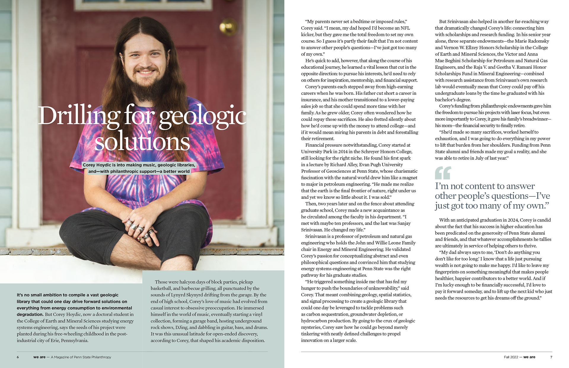
We Are Magazine Layout: Drilling for Geological Solutions
Creative concept / Typography / Page layout / Photography
A bold, personality-forward layout that captures the energy and individuality of a Penn State doctoral student supported by philanthropy.
For this feature on doctoral student Corey Hoydic, I met him at his home to photograph a setting that felt relaxed and real—one that reflected both his academic drive and his creative spirit as a DJ and music lover. The goal was to pair the tone of the article with imagery that showed Corey as both a thinker and a uniquely down-to-earth person. The final layout balances strong typography with a full-page image that invites the reader into his world.
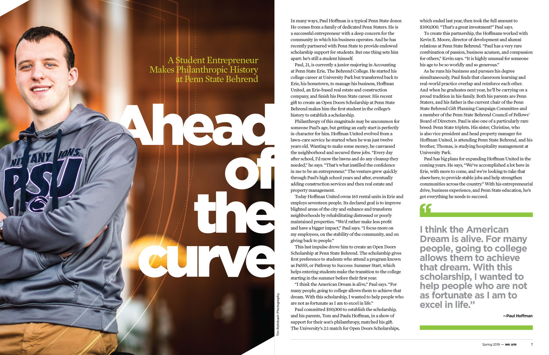
We Are Magazine Layout: Ahead of the Curve
Creative concept / Typography / Page layout / Photography direction
A collaborative magazine spread that combines purposeful design and photography to highlight the impact of Penn State’s Open Doors programs.
This We Are magazine spread was a collaborative effort to visually communicate the impact of Penn State’s Open Doors programs. I worked closely with a photographer across the state to bring the story to life—providing creative direction for the photo to ensure it aligned with the tone, message, and layout vision. From framing to atmosphere, the image was intentionally crafted to support the content. Combined with clean typography, the final layout is a strong example of cross-discipline collaboration and design with purpose.
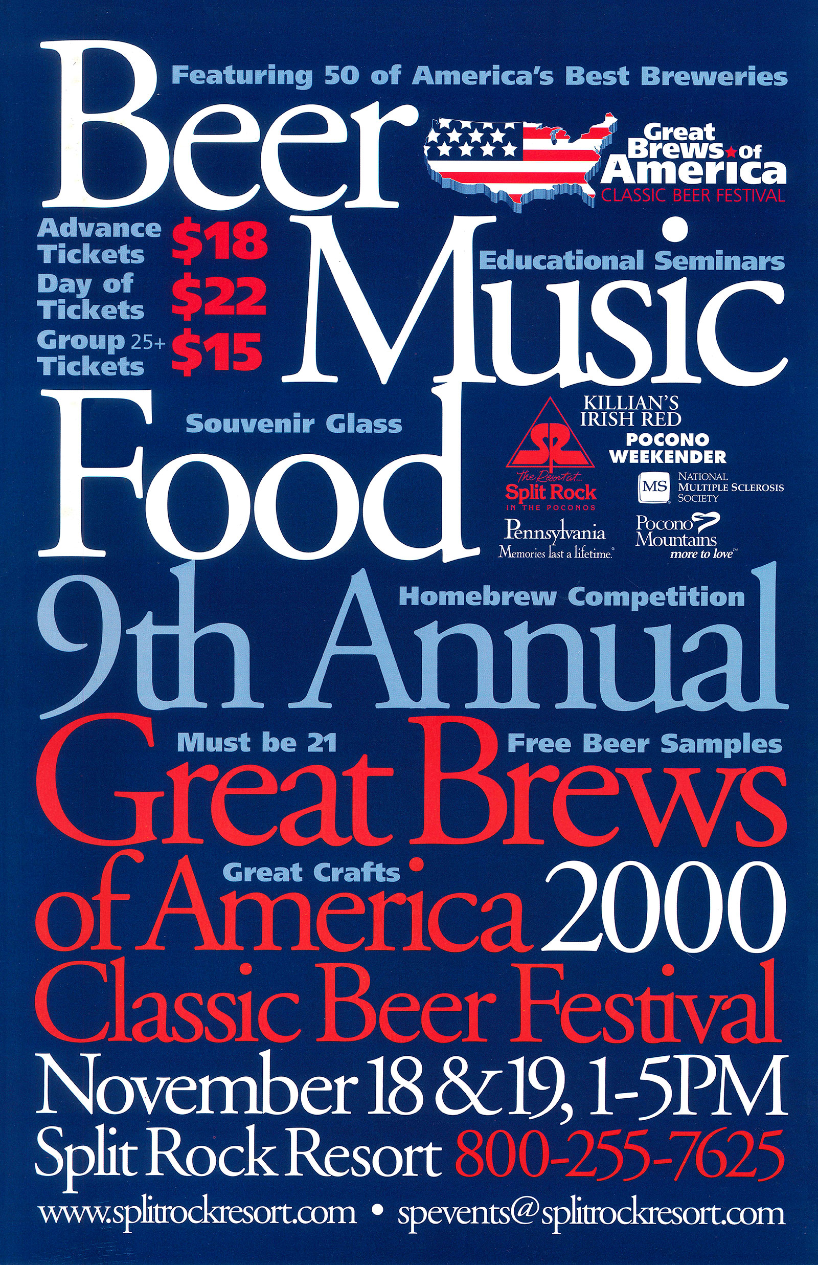
Split Rock Resort Great Brews of America Festival Poster
Creative concept / Typography / Graphic design
A dynamic poster design that uses typography, scale, and color to clearly communicate key event details while capturing the festival’s lively spirit.
This poster for the Great Brews of America Classic Beer Festival was a fun but complex design challenge: convey a lot of information—from dates and pricing to sponsors and attractions—while still creating something bold, legible, and eye-catching. I used typographic contrast, scale, and color to establish a clear visual hierarchy and guide the viewer’s eye through the content. The final layout balances the excitement of the event with the practical need for clarity—because no one wants to squint when beer is involved.

